As a follow up to my dissertation post, I wanted to do a post that briefly summarised my reasoning of picking my chosen subject, as well as some influences I had in getting there.
Since I started experimenting in the Print medium, I've discovered that it is predominantly linked to fine art, whereas I approach the medium from an illustration perspective. I'm not saying that there aren't successful illustrators who practise printmaking, but they tend to be outnumbered by fine artists. It also seems to be a medium that can often be overlooked, something I'm guilty of until I realised the error of my ways!
I've mentioned numerous times before in my blog that for me, print just seems to fit; something I find difficult to expand upon but i'll try. I started with print after being advised by my lecturer that she felt it was a media that would suit me and I should try it; so I did, and fell in love with it! For me, the fact that printmaking has so many options definitely appeals to me, that you don't necessarily have to be limited to one technique. I also like that print can be experimental, that you can stumble across an effect accidently but it works for the best. With print, I find myself wanting to try every technique, experiment, combine them and see what they can be used for and what they can't. It's a medium that i'm still learning but from what i've got at the moment, I think it's one i'm going to persue.
So hopefully my dissertation will help push this interest further and maybe even reflect into my work.
Here's some of the work I've found whilst conducting the initial research for my proposal:
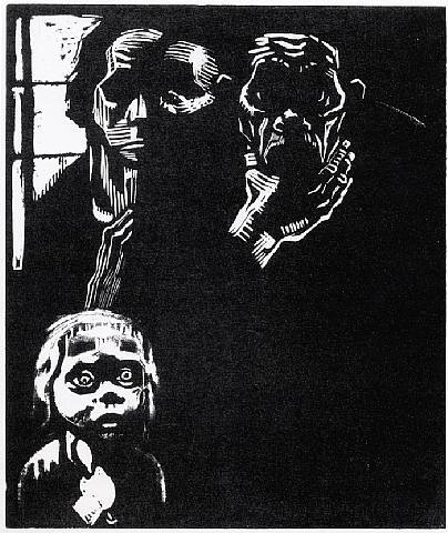
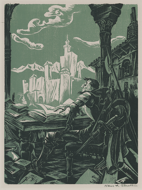
Hans Alexander Mueller:
Although there are many exceptions (above and below being two!) I tend to think that many woodcuts/Lino can look dated when looked at in a modern sense. I love it when I find one that is timeless, a true sign of a master printmaker.
Lynd Ward:
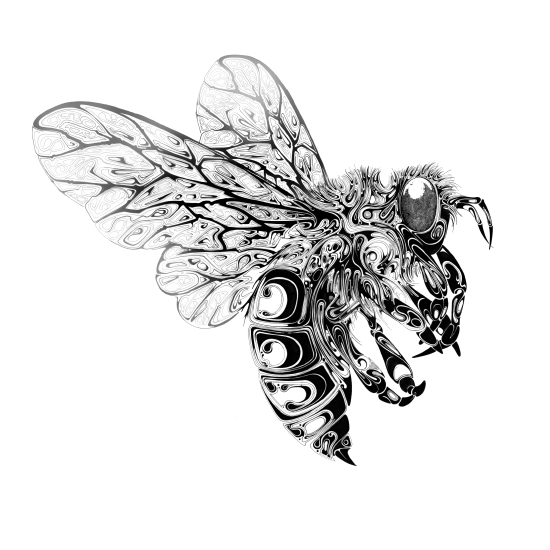
AJ Masthay:
Although I haven't really ventured into colour yet with print, I think the above example is incredible, to the point where it is almost unrecogniseable as a linocut. I like how Masthay creates such powerful images in all his work, something I aspire to do in the future.
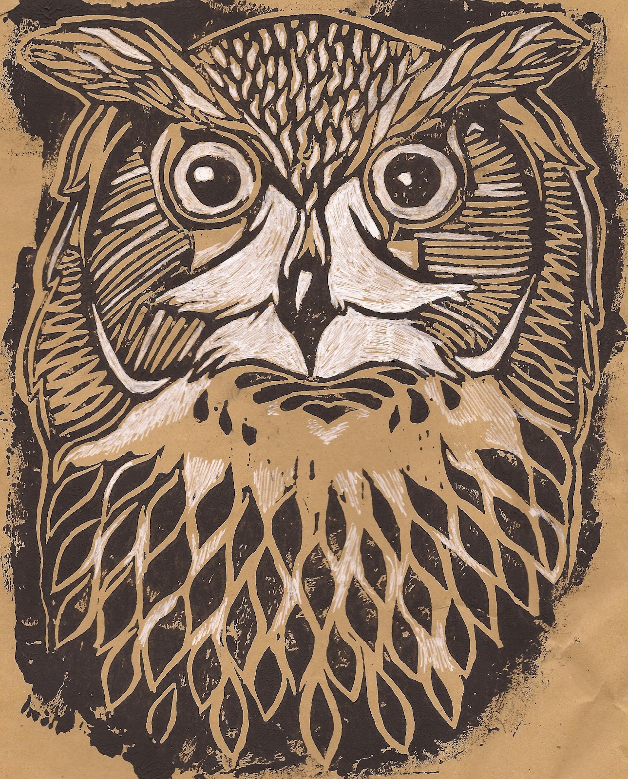
Nick Morley:
Nick Morley may be better known as LinocutBoy, all his work is lovely and changes the way that print is often used. In the above example I particularly like how all the lines have a purpose, they're not just pieces that were left behind by the cutter but add to the detail of the face. I'm interested in using patterns with linocut, something that stemmed from seeing this image.
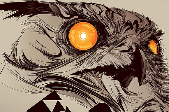
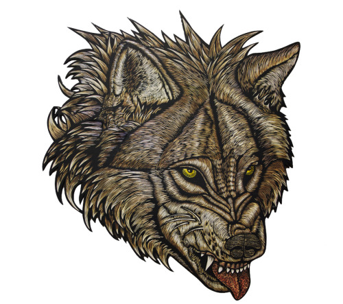
Wolfbat Studio:
Dennis McNett and wolfbat studios create very powerful images, obviously alot of wolves are featured, and like Masthays work, they can go to the point where it can be overlooked as a print. I think that just goes to show the skill in which these printmakers have, to be able to work the notoriously difficult medium in a way that makes it look flawless.
I think this goes to show that although I may not have discovered the style in which I want to work in print yet, I'm gradually taking bits from prints that I see and trying to apply them to my work.


.jpg)