Friday, 3 February 2012

I hate to say it, but your face is difficult to draw.

And Breatheee. .
Asessments are DONE! Although I don't know how I got on yet as we haven't had feedback, so my fingers are still crossed. But we've been given two new briefs to keep us busy before we start back next week.
They're both competition briefs, preparing us for next year when we have to enter them. The first one is the D&AD brief where Little White Lies magazine have chosen 5 films of 2011 (Drive, Tinker Tailor Soldier, Spy, Black Swan, The Tree of Life and Super 8).
Something I found difficult was drawing the people, the magazine has a distinct style of portraits of the cover (Gary Oldman has a ridiculously wrinkly face!) and sometimes I can be quite hit and miss with faces, so after initially drawing the main characters faces a few times to become familiar, I sat and "researched". Although I haven't seen The Tree of Life, I watched the other 4 films and after a few ideas, sketches and compositions I scanned them into my good friend (not) Photoshop. However I don't particularly like the vector style that using the computer creates and so I tried to just use the computer to clean the image up and put it into the magazine template.

 Drive - Pencil illustration with ink flicks, later altered in Ps.

I still felt that the images were lacking something, and once again and maybe predictably I turned to my new love that is printmaking.
 Black Swan - Pencil illustration slightly altered in Ps with monoprint crown.
 Black Swan - Linocut 

 Drive  - Linocut with pencil illustrations, altered in Ps with monoprint typography.

I've said it a million times but print just seems to fit with me, I feel comfortable in it but also find myself pushed at the same time which is a perfect balance. And so for this brief I used a bit of lino and monoprint, combining it with my illustrations in order to bring a contemporary feel to the end image. Combining bits of print with illustrations is something that I am interested and want to take further this nest semester in order to bring a fresh way of working in print to my work instead of using one technique alone. We'll see how it goes . .

Wednesday, 4 January 2012

Merry Christmas, Happy New Year, let's get started! . .

. . Right now, i'm in a state of slight panic. In a few weeks we have our first semester assessments, and unlike last year, they actually count! *Gulp* Actually that may be a bit over dramatic, I'm actually NOT that worried (yet).
We don't start back at Uni until next Tuesday so really I should say i'm currently in a state of faux calmness which I have no doubt will disappear when I have to catch up with my lectures after the holiday.
Before we broke up I was slightly stressed because I realised if I wanted to enjoy any of my time off, I needed to get my print work sorted out considering I couldn't do much of it at home.
I managed to do that, then sat down with Yadzia to talk about my editorial brief to which she said I should do it in Print .. my heart sank. Don't get me wrong, if these past weeks have shown me anything, it's that I LOVE printmaking however it's annoying that I need the printroom to get the best results.


Shiny new print tools!


Suddenly I had another 4 linocuts to do, on top of the other prints for my other briefs. I know to some this won't seem like much, but i'm a listmaker and not very patient which means that when i' staring at a gigantic list of work, I feel like I have to start doing it and won't be happy until I can check them off!
Anyhow, I'm now 3/4 linos done, modified the previous linocuts, redone screenprint and an etching. So all in all i'm content with how my work has gone.
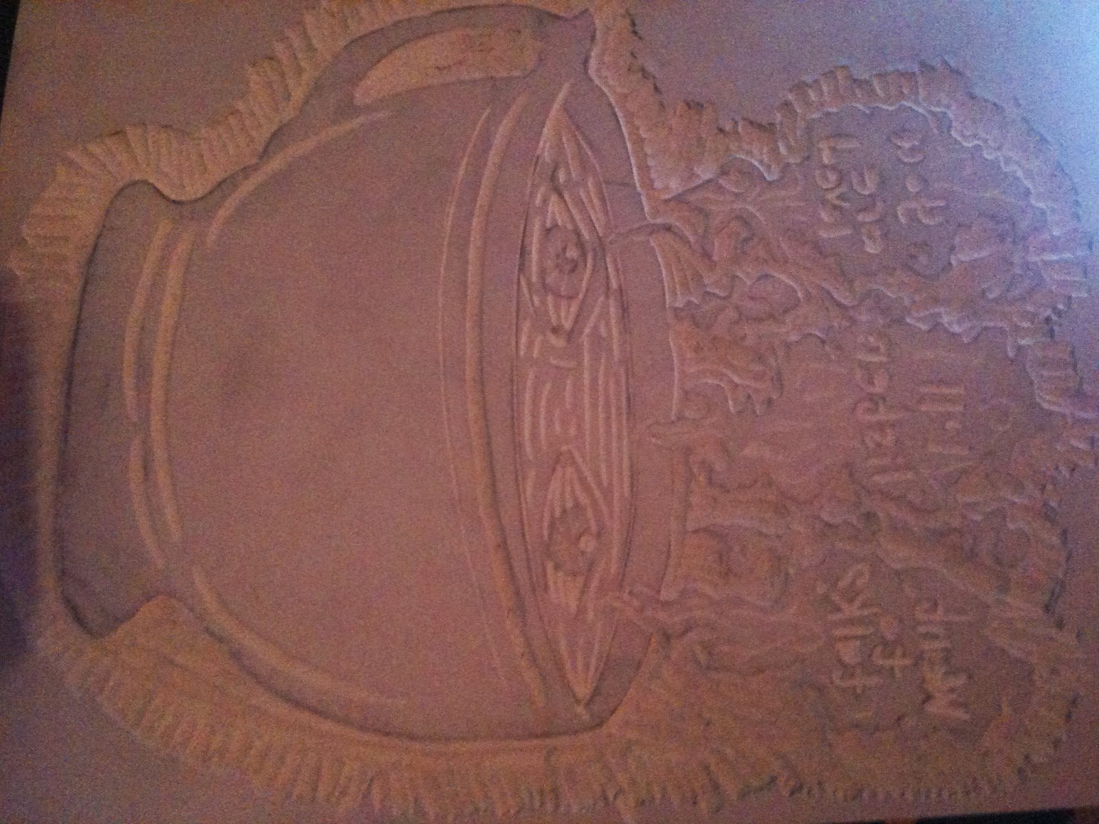
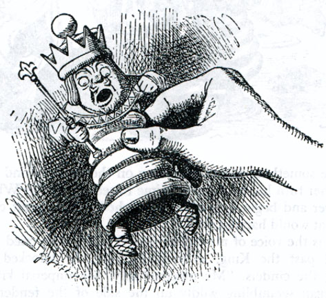
 Alice In Wonderland theme-Linocut image with experiment screenprint sheet.

Identity collagraph plate.

Linocut for article on Carridge horses in New York, Unfinished.
 Linocut for article on New York riots, Unfinished.

Linocut for article on man who lives near suicide hotspot and prevents deaths, unfinished.

Friday, 25 November 2011

Discovery and experimentation.

“Printmaking is about discovery, about experimentation; art itself is about discovery and experimentation.”

 Recently I've found myself drawn to printmaking, after the previously explained talk with lectures and experimentation I've realised that it's a path that I'd like to try out as to what media I'd like to use.


These are two of many prints that I feel inspired by, the one on the left is by a University student whose blog I stumbled upon, whilst the one below is by the incredible print-maker Daniel Danger (even his name is cool!) I find myself constantly finding prints online and in books that I absolutely LOVE the look of, which only furthers my determination to try any techniques that are available to me. I'm currently trying to experiment and see what combinations go best together. I want to be able to combine print techniques with other traditional methods to produce interesting images instead of just printmaking alone.

Although at the moment it's a bit stressful that I still haven't finished any brief purely because I have to finish it in print but hopefully it'll be worth it. We've also just been given a new editorial brief, something that should be interesting considering it has to be a week turnaround and has me thinking whether I'd be able to do that after uni, or whether it doesn't fit with print, so if you know of any professional print-makers who have successful careers with editorial work then drop me a message!


This is the result of my first ever screen print which is for the proverb brief. It's a two-tone print which turned out quite good, and is definitely a process  that I'll be trying again! Happy days!


Wednesday, 16 November 2011

First taste of competition.

For the past couple of weeks we've been working on a Proverbs brief, a joint project with art schools in Warsaw and Katowice, Poland. We have to take a polish proverb that translates into English and create an image preferably using both meanings. So I started with the usual mindmap process, wrote down all the quirky proverbs that would be fun and started sketching.

 P:The blacksmith was guilty but they hanged the gypsy.
E:The scapegoat suffers not for his faults.
P:The beggar spoke to picture but picture gave no answer.
E: Like talking to a brick wall.

Now, for a while the lecturers have been going on about getting a style, we all have one but maybe we don't see it or we just find it hard to keep it consistent. Ever since first year they've stressed the importance of having a recognisable style and how it will affect our future work. When they first mentioned this all I could think was PANIC! I couldn't for the life of me see my style and if I did, I didn't like it. I kept pushing, forcing some sort of style but nothing would come so typical over dramatic Natalie began to think that I was destined not to have one. Alas! You can imagine my delight when on one Tuesday afternoon I wandered into the print room and spoke to the lecturer there and found myself starting an etching, and I loved it!
 From little acorns great oaks grow
Dry-point etching - 1st attempt

I've dabbled in print before but nothing serious and it's always something that I've wanted to progress with. Then I spoke to my  lecturer with the print-maker and we all agreed that for this semester I should spend some time with print and furthering my understanding and skills.It sounds stupid but it feels like it fits, lord knows Photoshop and myself aren't going to become friends anytime soon and there's just something about printing that I find intriguing.
So for the past couple of days I've been scouring the internet to find artist research etc and it makes me want to experiment with it, a sort of mixed media printmaking piece. When I graduate I don't want to be a plain Jane and want to combine different techniques, even as a second year, it's clear to see that if I want to go into the creative industries then you have to stand up and be noticed and considering these proverbs will eventually be put into a published book, this may be the first step!

Monday, 7 November 2011

Begin at the beginning and go on till you come to the end; then stop. .

. . And so I will.
Myself and some friends went to check out the new Alice In Wonderland exhibit at Tate Liverpool. I found it quite fitting that whilst on the train up to Bidston I found myself sitting across from a woman with a goldfish in a jug of water, very Wonderland-esque, curiouser and curiouser!
So when we walked into the ground floor gallery, my heart sank as we were surrounded by modern artworks, and I feared that I had just spent £6 to see an exhibit I could hardly understand. After passing a bundle of sheets with two, god only knows what they were, sticking out of it, neon lit Wonderland related words, we bumped into one of my favourite lecturers who had told us about the exhibit. We spoke for a while about how as illustrators we should remain open minded when it came to work, that it's rare now to see a story that so many people feel inspired by and is ultimately timeless like the adventures of Alice have become. She never fails to inspire me when we've spoken, so with this new outlook we left the modern world and took the lift down the rabbit hole . .


The next floor immediately felt like it was going to be better, with deep red walls littered with mad quotes that seemingly made so much sense. It was the Wonderland exhibit that you'd hope for. There were oil paintings of little girls daydreaming whilst immersed in books, a chance to see the real Alice and incredible originals by Dodgson (Carroll) himself.
My favourite (albeit brief) part was two old looking armchairs pushed away into a corner of the gallery next to a small table that was filled with just a few of the different interpretations that Alice in Wonderland has inspired. I would have loved to have sat there all day looking at these books that ranged from original illustrations, graphic novel format and Suzy Lees bizarre photo-illustration picture book.

To be able to see how one story is able to inspire so many others to recreate it is extraordinary, the exhibit shows just a few of the books, illustrations, surrealist movements and many more forms of art. I think Alice In Wonderland is so insane that it makes sense to people. There's no right or wrong way in which you can interpret it, whether it's as a nightmare or an adventure, a coming of age story or a wake up call. At some point in life, everyone feels lost, whether it's for a brief moment or a lifetime and Alice stumbling through Wonderland speaks (to me atleast) of a journey. This may only be my interpretation of it, but isn't that great? That people can take different things from just one story, that some may relate to it whilst others can only see it as a fictitious childrens story.
So why has Charles "Lewis Carroll" Dodgson's tales of an alternative world of mystical creatures and crazy characters such a timeless classic? Well, because . . we're all mad here ;)

Monday, 24 October 2011

I've decided to create a blog to run along side with this one, it'll feature notes and thoughts about design lectures we have during the semester. So, anyone who wants to check it out, head over to http://design-pastpresentfuture.blogspot.com/

Wednesday, 19 October 2011

Year 2, let's go.

So two and a half weeks into the second year and here's what's happened so far. .
It looks like second year will be more specialism focused, i.e general illustration for me. So far i'm liking the approach to second year, we're being treated more maturely and have a lot more studio time instead of being told what to do. However they have this idea to put us with graphic designers which so far isn't working (mainly because we keep getting told we illustrate things to much, whattt?) but we'll see.
So, work wise this is where i'm at:


We've been set two week long projects that are setting us up for a longer project. Week 1 was to create a profile of someone you know without actually drawing them but objects of theirs and things you associate with them.
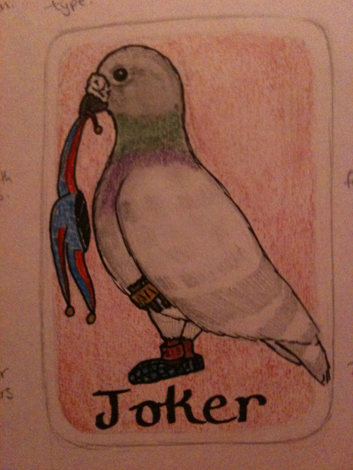
I chose my grandad, this is just a rough sketch of what it should look like. for the final piece I decided to make it 3-Dish using feathers* and card etc but left it in uni so here's a taster. For as long as I can remember my grandparents back garden has been home to racing pigeons and it was always a joke in the family that those birds were his life, so obviously pigeons had to be in the image.
*Future tip for using feathers, DON'T!


Anyway, second week long project was to find an image and create another image with a word that word anchor its meaning. After spending most of the week trying to make sense of the brief and getting different versions from different lecturers I decided to just go with what I had. Turned out pretty well I have to say, I think i'm realising that the less you try to impress the lecturers then the better it works out.
These are two examples of what I did, although they didn't do what the brief said specifically, Yadzia seemed to like the one on the left so I think that's probably the one i'll re-do into a final piece, It's titled "Unknown".
So, just to sum it all up, second year is going swimmingly and hopefully it continues :)
P.s. Apparently we have to start blogging notes from our contextual studies lectures that we have but i'll try not to make them to boring!
Until next time . .