Showing posts with label Linocut. Show all posts

Tuesday, 5 February 2013

Sorry I haven't blogged, my parrot got in the way.

Wow so I've been MIA for a while, I'm fairly certain I haven't blogged since around last summer. Whoops? As the title indicates I've been fairly busy. Between extra hours at my "real" weekend job, babysitting little cousins and yes, buying a miniature parrot that needs constant entertaining and likes to eat sketchbooks. However! I'm now a third year student aka final year before the dreaded jump into being "professional", taxes, kissing my beloved student discount goodbye and what not as so will be blogging like there's no tomorrow.


Meet Bixby
Possibly the worst pet for an illustrator

So as I said I am now just over half way through my final year *gulp* and so far I'd say this year has lived up to the expectations of higher stress levels.
For the last couple of months I've been refining my illustration technique, an alternative for my printing method and also altering my design and thinking process. It's been tough, many curse words said and after numerous rants (and even a few stray tears) I hopefully have it cracked. maybe.
I realised that I had previously been drawing up my ideas and finals in a way that didn't reflect my chosen medium of linocut printing and so I've spent the first semester altering my methods whilst trying to complete the projects.

Here's a peak:

Now this year we had to come up with our own briefs, and so I won't disclose the details for this just yet so they may not make sense out of context but all will be revealed soon enough.


Half finished rough inked with indian ink 
Taken into print

This is for the competition project "Picturing time", I chose to work with the quote "Time sometimes  flies like a bird, sometimes crawls like a snail but man is happiest when he does not notice whether it passes swiftly or slowly".


This was for the penguin book cover competition for "The Big Sleep" but it got rejected by my tutors at feedback. 
The Big Sleep definitely caused me some grief, my initial idea was thrown out by my tutors just before assessments and so I redesigned it (i'll probably post it later). But it was a learning experience and will probably still go in my portfolio.

So like always any feedback or comments are welcomed. Until next time!

Monday, 18 June 2012

Summer style

So since I last blogged, we had second year assessments (I passed) and am now an official third year student! SCARY!
As well as my dissertation (which I'll be blogging about at a later date) I have dedicated this free time to starting some personal projects and working on my "style". So here's a little update of what I've being doing with all this time off so far. . .

I started by looking around for some inspiration as to how I wanted to work. Primarily working in linocut I liked the idea of using patterns because I think that it shows up well in the print media but also has the ability to work in pen and ink for finer detail or shorter deadlines.
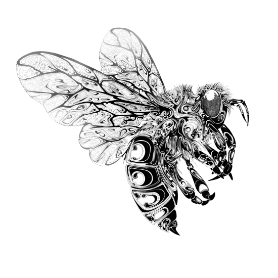
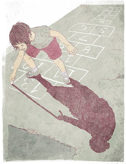
I drew inspiration from the likes of Swoon and Lynd Ward (who I've blogged about previously) as they work in the same media, but here are some other artists whose style I particularly like and want to try to draw from:
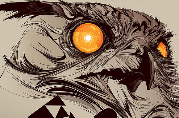
Kakofonia
Andreas Preis
Si Scott
Luke Dixon
So with these artists and styles in mind I began to sketch a few things like birds, other animals and tried some portraits to improve in that area too:
Crow study style test

James Dean Style test
Tiger style test
 I liked the way that these initial sketches had turned out and couldn't wait to try print in this way as I haven't really done anything particularly detailed with linocut. So with this in mind I began to do some more sketches and doodles with the possibility of taking it into print in mind whilst drawing it. This meant working at a slightly bigger scale, considering where bold black areas are and the contrast of the image, something I need to get into the habit of when working in linocut!
Skull style test
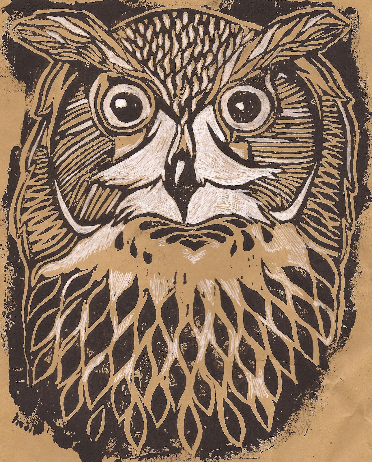
Owl style test in linocut
 I finally took one into lino, experimenting with different papers and colours and combining the dark lines of lino with adding white in certain areas. I'm quite pleased with how it came out and can't wait to continue to experiment with other images.
Magpie Colour style test

Red Panda Colour style test
So I've moved onto looking at how to use the patterns and bold blocks of dark lines that you get in print with a watercolour finish. Like I said I'm pleased with where my style is going and look forward to pushing it further throughout summer.
I'm currently turning my focus away from an animal subject to figurative and portraits in this style to see how it works and will post my results at some point! (Really this is just a procrastination exercise away from the dreaded dissertation but shhhh it's still productive!!)
Hope everyone's having a lovely summer! and any feedback etc. is always appreciated . .

Monday, 16 April 2012

Trying to balance . .

. . personal work with professional (kind of) work. .

So this easter break I had quite a bit of work to get through. I had taken on two personal projects; one being a present (which i'll post at a later date) and the second being an antry for a local exhibition/sale.
The exhibition is put on in my local town by the church every year, where the local press and general public are invited to see artwork that's been submitted (in any media, of any subject) and even have the option to buy. In past years I've either lacked confidence to put something in or missed the deadline so this year I was determined, and with settling into printmaking, I wanted to be able to go against the usual traditional stuff that gets entered.
So I started off the two weeks that I had off by trying to get these finished (although maybe I should have done it the other way with uni work first) I also recognised that I couldn't do anything too daring considering the audience that were probably going to see it but I still wanted it to represent how I work. Like I said I wanted to take a spin on the usual entries of flowers, still life, landscapes etc and so I settled on an animal picture with a twist.
 Watercolour brick wall
 Linocut cat image printed on top.
 Coloured using watercolour.
Window frame detail added.
Paper doily added for window detail (net curtain)
 Finally I window mounted and framed it.
Named: The Inquisitive Visitor (mixed media - watercolour, linocut and collage)

The exhibition isn't until the beginning of May but i'm glad I finished it in plenty of time instead of leaving it until last minute (as per usual). The exhibition starts on May 7th until May 12th, if anybody is out there and wants to check it out it's in Mold St Marys church! 
(I'll post how it's recieved when the event has been!)

Tuesday, 13 March 2012

Words ARE Images

We've recently been given two briefs that revolve around typography. One is a words and image brief which gave us multiple pieces of text that we had to pick three, create an illustration that would go with those chunks of text and compose a square page that flowed.
At first I got the wrong end of the stick (apparently) and chose the children's publishing text that was all about creepy crawly facts! I wanted to take an adult spin on them and create an old school monster movie poster but was quickly shot down when I spoke to my lecturer, gutted! And so I had to quickly come up with another idea with the text that was meant for the general illustrators, luckily i'd mind mapped for both right at the start (I'm learning to be thorough!) and so I had my idea and just had to push it a little further.
I'm learning that my idea process isn't necessarily bad and that so far *touch wood* I've managed to come up with ideas that not only the lecturers have ok'd but also I've liked them too. For me, it's being able to carry through the idea that's in my head (or something that looks similar to it) to be executed well and to a good quality. But I'm working on that!

Anyway, we were given several descriptions of things beginning with "D" and had to chose three we wanted to use, there was also a requirement to had the letter D on the page somewhere too. I chose ditto, dot and doodle. Dot (as in time) is represented by the clock face, Ditto is represented by the double apostrophes around the edge and Doodle is represented by the doodle type inside the face.

First rough visual.

The first rough was successful and got the ok and I got to work on the finals. I saw this as an opportunity to work with lino cut for typography, which I'd never tried before. Now I did try to work on a larger scale than normal to save any fiddly bits but it still wasn't big enough! and so I chose to just print selected words and then ink the rest in with a dip-pen after.

Final Lino cut with dip pen.
I cleaned the lino up in Photoshop (something I'm understanding a lot more nowadays!) before taking it into illustrator (understanding, not so much) to add the text that was required. 

Final Image.
Like I said before, we had to look at typography, something I'm not as picky about as some in my class! Too me type is type, it depends on the circumstance and how exactly you're using it and probably will never get into a heated debate on the apparently condemned Comic Sans. But I researched into some types and thought that this image needed a sketchy type as opposed to a formal one, I tried out a few and chose this one which is for some reason called LoveYaLikeASister. I didn't make it!

After a group crit this is the feedback I had: The text inside the apostrophes is not particularly legable (something that my course tutor said wasn't important, but wasn't there on the day of the crit!) They liked the typeface I had chosen and although they found it difficult to read the lino type they liked it overall with the only change I have to make being the apostrophe lettering. Overall not bad feedback.

We've also been looking at typography in groups after being assigned a typeface to research before giving a 10 minute presentation on why our typeface blows the others out of the water. Thankfully I didn't get san serif or serif but display! Yay! The other was hand drawn which I would have happily taken too! Anyway I personally have been looking at how typography can be used with imagery. Something that definitely helped with this brief. It made me think about the use of typography and what it can add to the image. We've not sat down as a group and put all the research together yet but I'll post about it when we do.

In first year I think I actually cringed when typography was mentioned, either that or I didn't take any notice because I didn't see any relevance to what I did. By doing these briefs and having more involvement in typography, my attitude is changing towards type and although I have a preference of hand drawn fonts, I do see its relevance, whatever form it comes.

Sunday, 4 March 2012

Inspiration galore!

In Uni we've been told that we need to start considering the way we want to work post graduation, who inspires us, who works similarly to us. Now for me, this is something I am CONSTANTLY considering, I feel like i'm always thinking about my (fingers crossed!) illustration career post-uni.
During the past couple of months, i've done extensive research into contemporary printmakers, particularly those in Illustration and the linocut process. From what I can gather, printmaking is a less practiced media than most, particularly in the illustration field and the creative industry. It's also hard to find illustrator/printmakers who use this unique technique in unusual ways to create interesting pieces. Personally, I love printing! I love getting a new brief, getting my initial ideas and being able to see how and what I can use to bring the best qualities of the image out, figuring out what I need to carve out and leave in, what mark making I need to do and finally pulling it (recently by hand). I think print has made me looser in my work, if I get a small nick or slip in the lino cutting, I make it work, no going back and thats had a positive effect for me.
I want to use printmaking processes (etching, linocut, monoprint etc) to bring unique qualities to the illustrations that I create, whether thats part or the entire illustration. Here's some examples of illustrators and printmakers who inspire me and the way that I want/try to work.

Swoon:
Swoon - A street artist based in Brooklyn who pastes increible linocuts onto walls around cities for people to discover, before they decay over time. I recently found her work, not in the flesh unfortunately, but if the pictures are anything to go by, she is a genius! The use of lino, for me, evokes an emotion from the unknowns who are featured and leaves you guessing as to who they are and what eactly they are doing.
Kelly Dyson:


 http://www.dontwakemeup.com/

Kelly Dyson - Found Dysons work through Googling gig posters and immediately connected with it, absolutely love the concept behind his pieces and although I don't have his skill, I see similarities in my work. He works in Lino and screenprint and was soon in my Artist Inspiration folder that I keep. At the time, i'd just finished an editoria brief which left me questioning whether i'd be able to be a printmaker and work in editorial. Dyson proves that not only is it possible, but it looks incredibly good too! I'm definitely a fan.

Niki Pilkington:
http://www.nikipilkington.com/

I've been a fan for awhile, I love that she incorporates unusual elements into her work, whether its a splash of colour, a pattern or a 3D element, she pulls it off amazingly. Her use of typography (and Welsh!) makes her work truly unique and can't wait to see where she goes in the future.

AJ Masthay:
 http://masthaystudios.com/

I love the use of colour in Masthay's work, almost unrecogniseable as a linocut. He takes printmaking into a new contemporary style that fits in but still stands out thanks to the vibrant colour and mark making that only lino can make.


Although these are just a few examples, they are probably the ones that I go look to the most. All definitely deserve their place in my inspiration folder, and motivate me to reach new levels in my work.
They're all definetly worth a follow on the ol' twitter too!


In Uni this week, it's creative futures, a week where guest speakers come in a talk about what they do, how we can get to where we want to be, how they got to be where they wanted to be and many other things. (Unfortunately none of the above will be making an appearance)
So! this week i'll blog about each of the days, who i've heard from and what they said!
Last year was a mixed bag, some incredibly inspirational talks whilst others left you questioning why you were there (and why they were there!). So hopefully no repeats, i've already marked my schedule and I seem to have chosen a good bunch. . . i'll keep you informed.

Wednesday, 29 February 2012

All for a yellow pencil. . .


So after drawing an insane number of cats, I finally got around to the final linocut. As I mentioned in the last post, this brief was for The house that Jack built which is going to be entered into the Caldecott competition, a competition that is for illustrators to take on a Randolph Caldecott piece with the winner being awarded the Yellow Pencil (which is apparently a big deal!).

So feedback was pretty positive, things to change that I already flagged up so nothing major. The doormat needs changing as watercolour doesn't necessarily work with the image but not too much will change. But
 now my lecturer wants me to create a SERIES of images that go with this image, I think i've figured out how i'm going to do it but havent got around to actually doing it. Busy, busy, busy. . .

This brief though has given me the chance to learn what I can do with Lino, with light and dark and using it with other media such as watercolour. I'm gradually finding the way in which I want to work, now its just making sure I use the media to the best standard and come up with the best ideas that work in it.


Our current brief is more of a typography based where we have to take 3 pieces of text, create an image that goes with that tet and compose a page with it all included. Didn't get off to the best start with this brief but first roughs critique tomorrow so i'll blog at a later date!

Thursday, 16 February 2012

Cats, cats and more cats...

As well as the Little White Lies brief that i've posted, we were also given a Caldecott brief. We had to choose a piece of text that Randolph Caldecott has previously illustrated, and create an illustration to represent that text. After researching, I went with The House That Jack Built, a text that I think most people will have atleast heard of in some form. Being in a class that is made up of graphic novelists, childrens illustrators and general illustrators, we have constantly been told that we should have a style that suits our specialism. Being a general illustrator myself, we get told that if we get a brief that is given to all 3 specialism (Caldecott being one) then we should be able to take it and give it a twist. The pieces that Caldecott illustrated were mostly childrens texts/poems, so we had to take it and turn it into an adult piece, or atleast make it less childlike. So I took THTJB and made the cat a darker character, created a back story of a squatter with a dark side.
I played with the text so that the original piece:
This is the cat, that killed the rat that ate the malt that lay in the house that Jack built.
Became:
This is the cat, that killed the rat, drank the malt and lay in the house that Jack built.


 We had a group crit but i'm absolutely rubbish at explaining my ideas and so after a long talk with my lecturer I finally got it ok'd, and so experimentation in media began...


 Initial Linocuts for cat.
Left: Lino and pencil. Right: Lino and watercolour.

Watercolour and brushpen.
Two experiments of lino and watercolour.
Experiment with showing light and dark with Lino.
 
Sketch of how final image will look.
So I think i've decided i'll be using monoprint for background textures, the cat will be in lino and coloured in watercolour with the shadow either monoprint or another media. Hopefully finish it this weekend and post the finished pieces of LWL's and Caldecott on here, after a crit on Tuesday!

Sunday, 12 February 2012

Onwards and Upwards

This week we were finally given feedback from the first semester, I passed with a 2:1 (although thats roughly worked out) so i'm very happy with it! Was told what I need to improve on so hopefully I can put it into practice during this next semester.
These are the finished final pieces that were asessed, that i've previously posted but were unfinished:

Pigeon collograph with emboss background.
 Linocut.
Etching with Chine Colle.
 Linocut with Chine Colle.
 Screenprint with inkwash background.
Linocut with Pastel and Ink.

Friday, 3 February 2012

I hate to say it, but your face is difficult to draw.

And Breatheee. .
Asessments are DONE! Although I don't know how I got on yet as we haven't had feedback, so my fingers are still crossed. But we've been given two new briefs to keep us busy before we start back next week.
They're both competition briefs, preparing us for next year when we have to enter them. The first one is the D&AD brief where Little White Lies magazine have chosen 5 films of 2011 (Drive, Tinker Tailor Soldier, Spy, Black Swan, The Tree of Life and Super 8).
Something I found difficult was drawing the people, the magazine has a distinct style of portraits of the cover (Gary Oldman has a ridiculously wrinkly face!) and sometimes I can be quite hit and miss with faces, so after initially drawing the main characters faces a few times to become familiar, I sat and "researched". Although I haven't seen The Tree of Life, I watched the other 4 films and after a few ideas, sketches and compositions I scanned them into my good friend (not) Photoshop. However I don't particularly like the vector style that using the computer creates and so I tried to just use the computer to clean the image up and put it into the magazine template.

 Drive - Pencil illustration with ink flicks, later altered in Ps.

I still felt that the images were lacking something, and once again and maybe predictably I turned to my new love that is printmaking.
 Black Swan - Pencil illustration slightly altered in Ps with monoprint crown.
 Black Swan - Linocut 

 Drive  - Linocut with pencil illustrations, altered in Ps with monoprint typography.

I've said it a million times but print just seems to fit with me, I feel comfortable in it but also find myself pushed at the same time which is a perfect balance. And so for this brief I used a bit of lino and monoprint, combining it with my illustrations in order to bring a contemporary feel to the end image. Combining bits of print with illustrations is something that I am interested and want to take further this nest semester in order to bring a fresh way of working in print to my work instead of using one technique alone. We'll see how it goes . .