Wednesday 29 February 2012

All for a yellow pencil. . .


So after drawing an insane number of cats, I finally got around to the final linocut. As I mentioned in the last post, this brief was for The house that Jack built which is going to be entered into the Caldecott competition, a competition that is for illustrators to take on a Randolph Caldecott piece with the winner being awarded the Yellow Pencil (which is apparently a big deal!).

So feedback was pretty positive, things to change that I already flagged up so nothing major. The doormat needs changing as watercolour doesn't necessarily work with the image but not too much will change. But
 now my lecturer wants me to create a SERIES of images that go with this image, I think i've figured out how i'm going to do it but havent got around to actually doing it. Busy, busy, busy. . .

This brief though has given me the chance to learn what I can do with Lino, with light and dark and using it with other media such as watercolour. I'm gradually finding the way in which I want to work, now its just making sure I use the media to the best standard and come up with the best ideas that work in it.


Our current brief is more of a typography based where we have to take 3 pieces of text, create an image that goes with that tet and compose a page with it all included. Didn't get off to the best start with this brief but first roughs critique tomorrow so i'll blog at a later date!

Thursday 16 February 2012

Cats, cats and more cats...

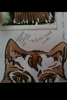
As well as the Little White Lies brief that i've posted, we were also given a Caldecott brief. We had to choose a piece of text that Randolph Caldecott has previously illustrated, and create an illustration to represent that text. After researching, I went with The House That Jack Built, a text that I think most people will have atleast heard of in some form. Being in a class that is made up of graphic novelists, childrens illustrators and general illustrators, we have constantly been told that we should have a style that suits our specialism. Being a general illustrator myself, we get told that if we get a brief that is given to all 3 specialism (Caldecott being one) then we should be able to take it and give it a twist. The pieces that Caldecott illustrated were mostly childrens texts/poems, so we had to take it and turn it into an adult piece, or atleast make it less childlike. So I took THTJB and made the cat a darker character, created a back story of a squatter with a dark side.
I played with the text so that the original piece:
This is the cat, that killed the rat that ate the malt that lay in the house that Jack built.
Became:
This is the cat, that killed the rat, drank the malt and lay in the house that Jack built.


 We had a group crit but i'm absolutely rubbish at explaining my ideas and so after a long talk with my lecturer I finally got it ok'd, and so experimentation in media began...


 Initial Linocuts for cat.
Left: Lino and pencil. Right: Lino and watercolour.

Watercolour and brushpen.
Two experiments of lino and watercolour.
Experiment with showing light and dark with Lino.
 
Sketch of how final image will look.
So I think i've decided i'll be using monoprint for background textures, the cat will be in lino and coloured in watercolour with the shadow either monoprint or another media. Hopefully finish it this weekend and post the finished pieces of LWL's and Caldecott on here, after a crit on Tuesday!

Sunday 12 February 2012

Onwards and Upwards

This week we were finally given feedback from the first semester, I passed with a 2:1 (although thats roughly worked out) so i'm very happy with it! Was told what I need to improve on so hopefully I can put it into practice during this next semester.
These are the finished final pieces that were asessed, that i've previously posted but were unfinished:

Pigeon collograph with emboss background.
 Linocut.
Etching with Chine Colle.
 Linocut with Chine Colle.
 Screenprint with inkwash background.
Linocut with Pastel and Ink.

Friday 3 February 2012

I hate to say it, but your face is difficult to draw.

And Breatheee. .
Asessments are DONE! Although I don't know how I got on yet as we haven't had feedback, so my fingers are still crossed. But we've been given two new briefs to keep us busy before we start back next week.
They're both competition briefs, preparing us for next year when we have to enter them. The first one is the D&AD brief where Little White Lies magazine have chosen 5 films of 2011 (Drive, Tinker Tailor Soldier, Spy, Black Swan, The Tree of Life and Super 8).
Something I found difficult was drawing the people, the magazine has a distinct style of portraits of the cover (Gary Oldman has a ridiculously wrinkly face!) and sometimes I can be quite hit and miss with faces, so after initially drawing the main characters faces a few times to become familiar, I sat and "researched". Although I haven't seen The Tree of Life, I watched the other 4 films and after a few ideas, sketches and compositions I scanned them into my good friend (not) Photoshop. However I don't particularly like the vector style that using the computer creates and so I tried to just use the computer to clean the image up and put it into the magazine template.

 Drive - Pencil illustration with ink flicks, later altered in Ps.

I still felt that the images were lacking something, and once again and maybe predictably I turned to my new love that is printmaking.
 Black Swan - Pencil illustration slightly altered in Ps with monoprint crown.
 Black Swan - Linocut 

 Drive  - Linocut with pencil illustrations, altered in Ps with monoprint typography.

I've said it a million times but print just seems to fit with me, I feel comfortable in it but also find myself pushed at the same time which is a perfect balance. And so for this brief I used a bit of lino and monoprint, combining it with my illustrations in order to bring a contemporary feel to the end image. Combining bits of print with illustrations is something that I am interested and want to take further this nest semester in order to bring a fresh way of working in print to my work instead of using one technique alone. We'll see how it goes . .