Sunday 18 March 2012

Chip Shop Story

On the last day of creative futures, Andy Cheetham of CheethamBell JWT, but his talk was about his time before his successful career and how he got his foot into the industry.

He started by drawing comparisons between the time where he was trying to get into the industry and to the current time, where we too are trying our hand. The 80's was in a similar climate as to what we are in now, redundancy was rife and it seemed like the odds were against you. Andy was a 24 year old, recently made redundant with no job to go in to and was made worse with things such as his car being stolen. He applied for a local newspaper job but was told that he was over qualified, that he should aim higher and go into advertising, and so he broadened his horizons and applied to ad agencies in Manchester. Although he got the job and stayed for a few years, he decided he wanted to move on and realised he needed a reputation if he was ever going to become part of the industry.


He realised that to build up a reputation he needed to get noticed and did this through the awards system. He explained that he collaborated with a friend and started their own agency, and planned on winning awards for advertising. He chose to advertise Barnacles, a North Wales fish and chip shop, which unbeknownst to the judges, was owned by his mother. They created press ads that were simple but effective, ads that ran in newspapers only and in mainly local press too before expanding after a few wins. He explained that they played on the fact that people love concept and that if you have a good concept then it will carry itself. At the time they were changing the way that things were advertised, taking it past long copy and making advertising more creative and effective.


Although he faced criticism and uproar by fellow agencies, due to the size of his agency, he went on to win numerous awards (D&AD, Roses etc) and top creatives loved it! The loophole that allowed smaller agencies with smaller press runs eventually closed, which put an end to Andy's winning streak but by this time he'd managed to achieve what he'd set out to. He'd created a buzz around him, showed his potential and became one of the biggest agencies operating outside of London. His story was also the inspiration behind the chip shop awards, an award set up for those that didn't fit into the mainstream categories, and shows that creativity has no limits.

CheethamBell JWT latest campaign for John West "Discover the story behind every can".

Tips that Andy left us with:
  • People still love a good concept!
  • You can't hide behind the economy - push through the bad times in order to reach success!
  • Put the effort in.
  • People who make things happen, don't know the word can't.
  • spend time getting things right.
  • Know what's good out there.
  • Edit, edit, edit - always evaluate yourself - be critical.
Andy's talk was very influential, and although it's in an area that doesn't particularly interest me as an illustrator, his story can be applied to all creatives and further afield! It shows that determination pays off and that even when it seems that everything is going wrong, you have to pursue in order to reach success. Triumph over adversity. Although it is not the type of work that I would want to do, however it is something that can be applied to everyone; don't wait for things to come to you. If you want something then go after it, no matter what is put against you (rules of the competitions in Andys case) and that you should never give up.

Thursday 15 March 2012

For Sale: Baby shoes never worn. .

. . Ernest Hemingway once wrote a 6 word story. If you think that it's sad, then you made it sad. It's left open to the interpretation of the reader, is it a tragic ending or just a baby that's particularly picky when it comes to shoes?


Stories are so powerful that we lie, exaggerate and omit the truth in favour of telling a good story - Errol Morris. 

Everyone's a storyteller, whether it's the latest gossip, what you got up to at the weekend or the next bestseller, we all have stories to tell. For a long time I didn't see myself as a storyteller, as someone who loves reading and has an absolute ton of ideas that could be made into stories, it's the putting pen to paper and running from beginning to end that I struggle. This being said, we were presented with two new briefs in studio this week, one for the general illustrators (me) that was a competition brief under "Secret London" whilst the other was the MacMillan Children's book competition. I like a challenge so I've decided to go for the book option, but to do the London piece as a portfolio piece when I have time.

With an emphasis on storytelling in the briefs, we were given a little lecture on the fundamentals. In the lecture we were shown a TED talk of Andrew Stanton from earlier in the month, it was extremely useful.


Andrew makes the point that we as storytellers have an aim to make the audience care, we need to carefully consider characters, the plot, the messages that we send out through the story. He also highlighted the importance of the beginning of the story, where we make a promise to the audience that the story is worth their time. I particularly liked that he said storytelling has guidelines, not hard set rules*. Something that can be applied to most things, rules can be broken, as long as it's done in an appropriate way and purposefully. *See Hemingway quote at top of page!
Before I saw this talk, I was debating on which brief to take, the one set for me (the safe option) or the challenging children's book. After this talk I whole heartedly went for the MacMillan brief, I want to challenge myself, I want to be able to tell a story, I want to evoke wonder! Who doesn't?!

Kurt Vonnegut on the shape of stories.

Dan Harmon's Story Circles.
 Here's some of the tips I picked up today:
  • There needs to be fluctuation in a story to make it interesting.
  • You have to be aware of the problems you introduce in your story; every problems needs to be solved.
  • You have to mindmap all the possible ways your story can go in order to get the best possible plot; explore every possibility.
  • Write what you know! Draw from experiences.
  • Don't be afraid to tackle sensitive topics, it can be done!
  • Exercise your imagination!!
I want to tell story that inspire, are imaginative and carry a message. Although I do struggle to write a complete story, I feel that if I stick to these reasons for writing and I'm passionate about the subject then I'll be able to.
Like I said, everyone is capable of telling a story, you just have to find the story that you want to tell!

Wednesday 14 March 2012

But that typeface is not as pretty as ours!

Here's some of the research that I've come across when researching artists that use words in their artwork and use typography as imagery, with a bit of what I've learnt about type thrown in too!

Tony Ariawan:
Greg Lamarche:
In this example, Greg combines a collage of decorative type that influences your view of the image. If the image was a stand aloe one then there would be a range of possibilities of what could be happening with them, what they meant. But with the type present, you automatically see the purpose. This shows how type can influence how you view things when partnered with things like an image.

Si Scott:
The thing I like about Si Scott's work is that the typography is often done in the same style that the imagery is, which means that they fit perfectly together. You can instantly identify someone to their style, and already having a type that fits your style saves time when you get a brief that requires it.


Craig Ward:
Alex Beltechi:

Alex creates incredible visual typography, this is simply an example of one. The text he creates usually reflects or at least compliments the imagery or theme that he has chosen. An example how text and image can compliment each other and convey a theme or message.

Yulia Brodskaya:
Yulia Brodskaya is an absolute genius, she creates typography that can be dull statements and brings them to life through patterns, colour and swirls! It's a way of visually communicating a message by combining imagery and typography.

Maria Boavida:
Maria explores type and image through her Illustration meets typography series. She wants the audience to take a journey of discovery, whether the letters lead you to see the image or if the image reveals the letters. This can show how typography influences how images and there messages are seen, or how images can reinforce the typography.

I'm constantly learning about type, and feel like i'm slowly getting a better understanding of how it can be used. I do tend to lean towards decorative/ hand drawn type, mainly due to my style of work and the fact I prefer to work by hand over the computer. To me, type is type, but like I said, I am beginning to see that there are different ways that you can use it, in different forms and for different things.
I'll get there eventually!

Tuesday 13 March 2012

Words ARE Images

We've recently been given two briefs that revolve around typography. One is a words and image brief which gave us multiple pieces of text that we had to pick three, create an illustration that would go with those chunks of text and compose a square page that flowed.
At first I got the wrong end of the stick (apparently) and chose the children's publishing text that was all about creepy crawly facts! I wanted to take an adult spin on them and create an old school monster movie poster but was quickly shot down when I spoke to my lecturer, gutted! And so I had to quickly come up with another idea with the text that was meant for the general illustrators, luckily i'd mind mapped for both right at the start (I'm learning to be thorough!) and so I had my idea and just had to push it a little further.
I'm learning that my idea process isn't necessarily bad and that so far *touch wood* I've managed to come up with ideas that not only the lecturers have ok'd but also I've liked them too. For me, it's being able to carry through the idea that's in my head (or something that looks similar to it) to be executed well and to a good quality. But I'm working on that!

Anyway, we were given several descriptions of things beginning with "D" and had to chose three we wanted to use, there was also a requirement to had the letter D on the page somewhere too. I chose ditto, dot and doodle. Dot (as in time) is represented by the clock face, Ditto is represented by the double apostrophes around the edge and Doodle is represented by the doodle type inside the face.

First rough visual.

The first rough was successful and got the ok and I got to work on the finals. I saw this as an opportunity to work with lino cut for typography, which I'd never tried before. Now I did try to work on a larger scale than normal to save any fiddly bits but it still wasn't big enough! and so I chose to just print selected words and then ink the rest in with a dip-pen after.

Final Lino cut with dip pen.
I cleaned the lino up in Photoshop (something I'm understanding a lot more nowadays!) before taking it into illustrator (understanding, not so much) to add the text that was required. 

Final Image.
Like I said before, we had to look at typography, something I'm not as picky about as some in my class! Too me type is type, it depends on the circumstance and how exactly you're using it and probably will never get into a heated debate on the apparently condemned Comic Sans. But I researched into some types and thought that this image needed a sketchy type as opposed to a formal one, I tried out a few and chose this one which is for some reason called LoveYaLikeASister. I didn't make it!

After a group crit this is the feedback I had: The text inside the apostrophes is not particularly legable (something that my course tutor said wasn't important, but wasn't there on the day of the crit!) They liked the typeface I had chosen and although they found it difficult to read the lino type they liked it overall with the only change I have to make being the apostrophe lettering. Overall not bad feedback.

We've also been looking at typography in groups after being assigned a typeface to research before giving a 10 minute presentation on why our typeface blows the others out of the water. Thankfully I didn't get san serif or serif but display! Yay! The other was hand drawn which I would have happily taken too! Anyway I personally have been looking at how typography can be used with imagery. Something that definitely helped with this brief. It made me think about the use of typography and what it can add to the image. We've not sat down as a group and put all the research together yet but I'll post about it when we do.

In first year I think I actually cringed when typography was mentioned, either that or I didn't take any notice because I didn't see any relevance to what I did. By doing these briefs and having more involvement in typography, my attitude is changing towards type and although I have a preference of hand drawn fonts, I do see its relevance, whatever form it comes.

Sunday 11 March 2012

So you want to be a printmaker . .

Working as a freelance artist (printmaking) by Ann Bridges.
Printmaking is definitely a medium that i've taken an interest in the past few months, I tried it out and instantly it appealed to me and my work. So I was a little sad that this was the only speaker in the week that was a printmaker!
Anyway, Ann spoke to us about her experiences at college, how she developed her printmaking technique into something unique and what it's like being a freelancer.
I was worried at first that this talk would lean more towards a fine art approach but once Ann had described this process, I instantly realised i'd gone to the right talk.


Ann briefly described her work process, that is based around monoprinting. Although it was hard to understand, not being able to see it, it's a stencil, monoprint technique where Ann experiments with cutting out the shapes and rubbing, wiping and layering in order to build up an image. This is what I particularly liked about Ann, she had gone through print and then adapted it to how she wanted to work, she hadn't just taken a traditional print technique and settled for the outcome but instead experimented and pushed the technique to become something that was unique and meant that she could create a more interesting style of work.
Since i've discovered working in print, i've tried out different methods in order to then take my favourite bits of them to use for different projects instead of specialising in one technique alone. I've found some that don't work well and others that I love to work in, and so Anns technique is something that is very good to see. Someone who has tried to push the boundaries of the print process by taking it further than the traditional methods. Printmaking isn't necessarily such a popular medium in this fast and digital time, and so I personally think that it's particularly important to refresh printmaking and make good use of its unique qualities.


I asked Ann whether she felt restricted in the media, something that I sometimes worry about, particularly after completing an editorial brief and questioning if such a long process of print would work in the quick natured industry. She explained that although you work in print, you need to find a method that can be adapted; something that I think i've already thought about. For example, Ann also has a method that combines illustrations with print should she need to work to a close deadline. I also think that when you build up experience in the chosen technique, you'll learn ways to work quickly whilst still producing a quality piece of work.


Although Ann did say that she wouldn't necessarily class herself as an illustrator, she uses printmaking for imagery not just to create patterns (which is what you mostly find in fine art methods etc) and so I can apply some of the things that she said into the way that I personally work. I want to continue to experiment in print, look into linocut in more detail and try out afew techniques such as reduction and multi block. I think thats one of the things that draws me to print, the fact that there's so many forms of it and new things that you can try.


Ann also gave us some advice: Get straight into work when you graduate, don't take the summer off! Give yourself time to experiment, things will go wrong and find new things, particularly for printmakers. You should constantly evaluate your work, be versatile, let the idea and process take you on a journey. Always keep a sketchbook, always look for work, use New Designers as a launch into the industry, and finally budget!!
Lots of things to think about! Overall it was a very useful lecture that has definitely got me thinking about the way that I work and how i'll work in printmaking in the future.

www.ann-bridges.com/

Friday 9 March 2012

Lecture via Skype. .

Martin Steenton - Blank Slate Book Publishing:One of our lecturers set up a "Skype chat" with Martin because he couldn't make it up to the university in person. Genius! 
It was a very insightful talk, I made the most notes of any other talks I went to throughout the week! So this may take some time. .

Martin currently works for Blank Slate, a comic book publisher.
He started out studying media in Uni, not knowing what exactly he wanted to go on and do but he had a passion for comics and so started a blog, with his girlfriend, about french comics. Through the blog he built up contacts and was soon getting calls for him to feature more comics on the blog, from the US and even the UK. Through the blog he was given the opportunity to translate for Blank Slate. He told us how important it was to get the initial buzz around yourself, and how useful the internet is for that. He worked for free, but wouldn't advise us to do artwork etc for free, he was simply doing behind the scenes things that he enjoyed but didn't necessarily cost him anything. It gets your foot in the door of the industry, something that Facebook, Twitter, blogs, going to conventions enables you to do. You need to get on the radar of those already in the industry and that the more visable you make your work, the better.

Sleepyheads by Randall C
Blank Slate

Publishing a book is something that I would love to do in the future, both in graphic novel format and childrens publishing. So it was very interesting to hear what it is that publishers are looking for, that often publishers have different styles that they lean toward. Firstly, when you take your idea to a publisher, some will only look at finished work, they're looking for a complete skill set. Whilst the smaller presses, like Blank Slate, are more accepting. They're more focused on finding new talent, aslong as you have a good idea behind and they can see how you finish your work (media, technique, quality) then they will look at your roughs and decide from there if it has potential. This is also where making contacts can be useful, if you already have some form of relationship with someone from the publishers, talked through twitter/emails or met them at a convention, it can make a difference when you are pitching. I learnt that you have to tailor your submission to the publisher that you are pitching to. Advice that you can also use for your portfolio, you should make sure that what you are showing is relevant to who you are showing it to. In publishing terms, you need to research the style that the publishers usually go to and see if you think you'd fit it. If you don't you're showing that you haven't and you also want the best for your work, so it's in your best interest to find a publisher who will do the most for your idea.

A long day of Mr James Teacher by James Harvey
Blank Slate

He gave us a case study of sorts in the form of Daryl Cunningham, who had apparently been trying to be published for awhile before finally getting a deal. He became Blank Slates best selling book with Psychiatric Tales - proving that you should stick at it. If you are confident in your ideas and work then you should persist. Cunningham was prolific on Blogger and gained recognition from artists such as Scott McCloud. Something that Martin pointed out as very useful when trying to promote your work, established artists will often help (although there will be some exceptions). Send your work to thos who inspire you in order to get feedback, if they like it they'll often give you a quote that can be used for the book when it comes to promotion.

Copyright was also mentioned, something that definitely confuses the heck out of me! Although Martin broke it down pretty easily, there are different copyrights and you can retain the copyright by giving publishers a timed license that runs out and returns the rights to the creator after a period of time (often when the print stage is done). However if you have a character that the publishers or anyone else is interested then you surrender all rights when you sell them over. He made a point of saying that we should always be careful with what you sign, be fully aware of what you're agreeing too.


Jim Medway - Playing Out
Blank Slate
I particularly like this because it's a linocut! Inspiring indeed!
When talking about publishing, it was inevitable that we would discuss its future, with the rise in digital publishing. So, is there still a need for traditional publishers? Martin assured us that print would never completely die out, maybe take abit of a hit whilst ebooks etc rise but it would always remain. Print will always appeal to those who prefer physical media, for comic books/graphic novels in particular - the ebook market is not particularly appealing simply because they're not meant to be restricted to one format on a screen. Digital publishing also opens the door for piracy, something that is incredibly hard to control once digital sales are in place. I definitely agree with all that Martin said, I personally work in a book shop and e-readers have recently been introduced into our sales. Sales are steady (I even own an e-reader myself) however there are many hours that i've wasted talking to people about the e-reader, only for them to turn around and pick up a paperback before they head out. E-readers are popular but, particularly for the comic book market, print is still much more appealing.

So i'll finish on some advice Martin gave us. Don't - be arrogant, be difficult to work with, be unfocused, send stuff that is nothing to do with what they do, ask for honest feedback unless prepared for it.

Martins talk was very useful, to be able to see how being active on the internet and using it in a useful and creative way can  influence your career, and to see what it is that those in the industry are looking for from those who want in. After this talk it's also good to be able to see what exactly we are able to do, I never had an interest in comics before coming to university and attending talks similar to this one, which changed my perspective and realise that there's more to them than muscley superhero stories.

So go look at their website, they have some fantastic artists on the books!

http://www.blankslatebooks.co.uk/


Up next: Printmaking - Working as a freelance artist by Ann Bridges.

Wednesday 7 March 2012

Sometimes I sit down to draw. .

but nothing comes out!

I have a ton of ideas that I want to get down on paper, but I sometimes get frustrated because I feel like I can't do them until i've refined my style.

So after Jonathan Edwards talk and advice, as well as feeling very inspired during this creative futures week, I decided to just put pencil to paper and draw, whilst thinking about my style. I know that I want to work in print, I usually work quite graphically, using various lines, weights and mark making techniques. I know what I want to do with print but I need to get my drawing stylised first in order to take it through print. I thought back to an exercise that my lecturer told me about not so long ago. He gave me a website, one that is made up of vintage photo's and he looks at the picture, finds particularly interesting people and draws them. I can't remember what exact website he gave me but stumbled upon my own in the form of Retronaut!

Give it a go, you will definitely find some characters!


Normal programming will resume shortly: Up next - Martin Steenton of Blank Slate publishing.

Tuesday 6 March 2012

Character design and social networking. . .

by Jonathan Edwards.


I was definitely looking forward to this lecture, if there's one thing I love about Creative Futures, it's when graduates who have been in our exact shoes (so to speak obviously!) and to see that they've broken into the creative industry successfully and are still achieving new highs. Jonathan Edwards is a brilliant example of this.


Jonathan told his story in two parts, he started off with editorial and comic book work before investing in his Inspector Cumulus character that he accidently creating when flicking through his sketchbook. Jonathan said that he always had an interest in vinyl and collectable toys, and that is the direction that he saw his character going in. It just goes to show that you should trust your instinct, you know your creation just like you should know how much is too much, you should also know how far to push it.

Jonathan touched on the issue that i'm currently having, the fact that we just sit around waiting to be asked to do something, I feel like someone is going to come along and ask me to do a commission etc whereas it should be me going out and making myself known. And that is what he did, he took his character to Play Lounge, a company that aims to represent the latest innovative toys that aren't necessarily restricted to child play. From there he was connected to Crazy Label another company dedicated to toy manufacturing. Jonathan had a very hands on approach to the production of his toy, having constant feedback with the manufacturers, referring to his original design and concept and even designing the packaging too. This is something that is particularly inspirational, how he was dedicated to creating a toy that reflected his original idea and not become distorted when it easily could.

In both parts of his story, social networking had a huge part to play in the success of his work. For Inspector Cumulus toy, the popular blog ToysREvil caught on to it and created a buzz around the character. Jonathan advised that we should use Twitter in order to get our name know whilst still in Uni, so that come graduation you've already got a head start. Now this is something I wholeheartedly agree with, and do try to put into practice however that send button because awfully daunting when you're sending something to, maybe not the most famous illustrator, but someone you admire. It's something I'll have to get over, and hopefully will with confidence!


Second part of the story- Alongside his partner Louise Evans AKA Felt Mistress, he has produced window displays for Londons best retailers including Selfridges and boutiques. They play to each others strengths, Jonathan comes up with the character designs then Louise (magically) turns them into felt toys. He described their experience with working with Selfridges, being featured instore and the window displays. They seem a very hard working pair! I was amazed to see that all of their characters connect in some way, a sign of a well thought out and detailed concept.
They also got intouch with a Japanese agency in order to take part in a residency in which they would create characters, something that played to the cultural differences of toys being a much more popular market in Japan as opposed to here in the UK. This again showed that you shouldn't be afraid to approach people with work, especially if you feel passionate about what it is you do.

The thing I like most about Jonathan (and Louise) is that he stays loyal to his style. During some of the talks this week, you can see how the illustrator has changed their original concept so much in order to satisfy the client or designer, whereas Jonathan, even when dealing with big named clients, stuck by the way that he saw his character in order to create the best possible outcome. That is definitely something that we as emerging creatives should remember; stick to your guns!


So, the parting advice, was that you should draw inspiration from wherever possible. Jonathan told us that he draws inspiration from things around him; people observing in cafes, shapes, real people (sometimes well known).It's something that I like the idea of but never seem to getting round to it or never have my sketchbook to hand, maybe i'll try to better myself during the summer. But the inspiration part has changed the way I look at things, I try not to close myself off to things, always listening to what people are seeing and if it can be used in some way, drawing and making a note of things that inspire me or ideas that I have so that I can revisit them in someway and some point.
He shared that he was once told that you either draw realisitically, with proportions etc or you draw using shapes, and the more I think about it, the more it makes sense. He said that for him it was a lightbulb moment and he suddenly realised that he had been doing it wrong the whole time, then turned his focus to shapes. I feel like he's triggered my own lightbulb moment, hopefully, so we'll see how it goes!
You have to get through the bad in order to improve, so the next time i'm sketching something and it looks awful, i'll finish it before I cry! This is something that I need to realise, I expect everything to look perfect the first time I do it, which is obviously not going to happen but I should learn from it and do it better the next time. Keep a sketchbook, set yourself goals, connect through social networks. For me, it just shows that if you find something unique, have good ideas and execute them well, abit of self promotion and you'll go far!
This talk also made me think about collaborations, its obviously had a positive effect on both parties work, one compliments the other and it goes to show that if you find the rightwork that influences/compliments yours then it can be beneficial. It's something i'll consider in the future.
A thoroughly enjoyable lecture, and dare I say, the best one yet (who cares if its only Tuesday!).

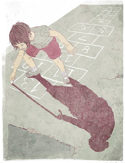
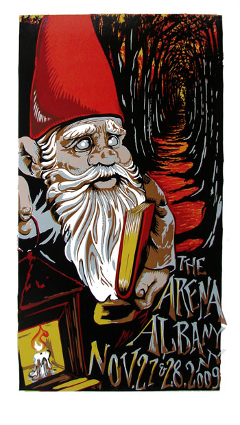
 All images belong to Jonathan Edwards - www.jonathan-e.com/


"I like to draw dead things" . .

Illustration and animation by Karen Cheung.

I'd googled Karens work before the lecture, to see what was in store and fell in love with her quirky style. She opened by saying that she initially studied zoology at Cambridge before trying again with illustration, a theme that is definitely reflected in her work.
She went on to show us an animation she had made, Headache Hotel, which can be viewed over at http://www.karencheung.co.uk/animation/animation.html.. along with other animations!
She has also made a childrens book, Shleepless, a book about a young boy having trouble to sleep, heavily ininfluenced by French picture books. However the unusual underlying tone, even though she won the macmillan prize! has left publishers unwilling to publish it with concerns that it may frighten children. Personally, I absolutely love what I've seen, the quirky concept, the mixed media techniques used throughout the book and the overall look, it's something i'd love to see on the shelf in work! I admire that Karen Cheung has pushed the boundaries of what is accepted as a childrens book in Britain, and glad that she hasn't conformed in order to get a deal. I hope in the future publishers come to their senses!


Karen got an agent soon after graduating Bristol University, and said that when putting your portfolio together you should consider what it is that you want to do; if you want to do editorial, they want to see people etc, concise, and that you should have different portfolios if you work in different styles. Karen didn't wait around for the jobs to come in but instead took her portfolio and went door to door in London to see if anyone liked her animations, before getting a call from 12foot6, fitting into their in house style and working there for a couple of years. This self promotion, to me, seems terrifying, I obviously need to become more confident in my work!


Karen also gave some insight into what it's like having an agent, that it helps to be versatile, to stand out from what others are doing, and that the downside is that you sometimes get passed work that you wouldn't normally take. This is where I begin to frown, simply because Karen has a style that is incredible and although that only my opinion, I can't be alone in. She showed us some work that she has completed through the agency and I can't help but think that maybe she was being a little too versatile. Some things she described as "not even remotely similar" to what she usually does, and she didn't seem as passionate about it as when she was talking about her animations or her book. Obviously i'm aware that it's easy for me, a clueless and naive student, to say that you shouldn't take on the jobs that mean you change your style. I understand that when the jobs there and you have grown up stuff to take care of, you're going to take it, however i'd like to think that i'd only do it to a certain extent. My style is the way that I work (although i'm still working on it) take it or leave it. . . I say that now and i'm sure if you check back in a year or two and i'll be drawing god knows what for god knows who!! Or something . . 

Like those before her, Karen finished by giving some needed advice: Work hard, trust yourself, listen and have fun. Explore, don't restrict yourself. And after graduation, be brave, work even harder, persevere and don't take it personally. Always be critical, it'll help you produce the best quality of work. Oh and apparently TAX is important! All gems that know doubt i'll forget. .

So, for me, Karen was definitely the highlight of the day. Her work just clicked with me, she seems like a lvely person and her ideas and the way she works is inspirational. I like how she has combined her illustrations with animation, something that I would like to look into in the future, although I don't think it would be a way in which i'd consistently work, but I do have a few ideas in which animation would be a possible way of communicating it. All in all, a wonderful guest speaker!

All images belong to Karen Cheung,  http://www.karencheung.co.uk/index2.html

Up next: Character Design and Social Networking by Jonathan Edwards.

Making a living from comics!

Building an audience: Making a living from comics by John Allison.

Although i'm a general illustrator, I do like the idea of producing some form of graphic novel at some point in the future. I've got a few ideas that would suit that format so I figured we'd tag along to the lecture.
I'll start off by saying that if there was an award for most entertaining lecture, John Allison would probably get it! I always envy people who seem so natural at talking in front of large groups, mainly because I become a rambling, bright red mess!

Anyway, carrying on from the last blogpost, John never trained as an illustrator at university but had a love of comics and thought he was a decent artist so he made webcomics on the side of his job. He is mostly known for his 2 latest webcomics, Scary Go round and Bad Machinery. Now personally comics can be abit hit and miss, mainly because of the way they are done. I tend to prefer handrawn and traditional methods of artwork as opposed to computer based images, so Johns work is difficult for me. He started off as a traditional artist, switched to Adobe Illustrator, then to another computer programme before deciding to go back to handrawn for a while. From what he showed us, I definitely prefer the handdrawn stuff, mainly because of personal preference, however most of Johns lecture was not about artwork but (as the title suggests) the importance of an audience and making it in the comic book industry.
John told us his progress from comic book strips on the side to where he is now, telling us that an internet audience (although I suppose it can be applied to any audience) can be hard to please. Readers don't particularly like change, whether its with characters, artwork, style or writing and that it is always important to consider the audience that is intended when you are doing the work, whatever it may be. You need to be consistent and control the amount of change, particularly in one piece of work. Something clear from Johns work is that it has changed dramatically over time, I can't help but think that, although your style of work will inevitably change in some way, i'd like to refine the way that I work early on in order to have a more consistent style.

Again the importance of networking was touched upon; you should make contacts with those who work like you (something twitter is amazing for!) go to conventions (mainly comic book orientated) and to study successful people, learn from the best!

John parted with some advice: Exposure is meaningless, Always keep learning, expose yourself to new things, learn to be a pain about money, be careful what you sign and that business cards are thrown away, be remembered!

This lecture definitely reminded me to consider the audience, no matter what it is you are doing, who is there to read/see it. Even if it reaches beyond that group that you have in mind, do it for someone other than yourself. This isn't something I consider in depth usually, but in future projects its something i'm going to try to have at the forefront of my thinking.

What do you want to be when you grow up?

Creative Futures Week - Key Note, Angus Montgomery.

So today was the first day of creative futures, a week of guest speakers from all creative backgrounds, who come in a talk about; what they did, what they do, what we could/should do. An incredible week, if done properly. . .

After the usual introduction speech and a less than usual speech about the life and times of William Shakespeare, stepped up Angus Montgomery, editor of Design Week, a magazine focused on design education. He introduced himself as a journalist, not a designer and expressed his envy of being in a room full of creatives. For me, it's not until someone reminds you that not every has a form of creative skill and it's definitely something that I occassionally take for granted.
Although his lecture was primarily focused on design (obviously) it was quite relevant to those who want to break into the creative industry in some way. He quoted many different people ranging from illustrators to editors and all had a similar thing to say; industry needs fresh talent, importance of marketing yourself (With a link to Shakespeare, who was mentioned at the start). But the one that stuck out for me was by Greg Quinton, he said to: Get off the internet (don't look at what everyone else is looking at), grow through collaborations in whatever way possible, and love what you do. The last one made me think of a quote i'd heard recently, Do what you love, and you'll love what you do. Something that's incredibly important to me, and something that is surely a must to everyone in some way. This will also crop up in a later post about another guest speaker we heard.

Angus also mentioned studio fees, a current problem for up and coming creatives due to the possibilities of universities charging £9000 per year for education. He asked the question to the same people as before, would you pay? and the overwhelming response was YES! Of course I think this is a very easy answer when you've already graduated and have a career within the industry! I don't think it's as simple as "ofcourse I want to do what I do so i'll pay whatever I need to".
In studio we're asked whether we think being creative can be taught, and the majority answer with no, simply because we all agree that we were never taught to have the ideas we have, we simply need a little guidance now and then of whether we're doing the right thing and what we can do to make it better. Is that worth getting into a ridiculous amount of debt for? It's definitely debatable! For me personally, Uni has helped me sort out what it is that I want, taught me that there are others who think like me, appreciate the same things I do, and how to execute the ideas that I have. Going to University doesn't make you an artist and there are plenty of examples of people who didn't study what they do and yet they suceed none the less.

He then finished off with some examples of the best uses of design that he's seen in the past few years, below are some of my favourites from his pick.

 Alan Clarke, Olympic posters.
http://www.alanclarkedesign.com/
I like how Clarke manages to use a minimalist technique of poster design and manages to show movement that instantly draws attention.

PearsonLloyd Design Ltd. A&E redesign.
http://www.pearsonlloyd.com/
PearsonLloyd recognised a flaw in the health system and set out to solve it, I love it when design can be used beyond aesthetic reasons. This design not only looks good, but also meets the needs of the public, who in this case, needed something that would  clearly show them what was happening around them.

So, overall, Angus Montgomery opened the week with a talk that definitely made me think. It made me think about how design can be useful for illustration, how grateful I should be that I have something i'm passionate about (and hopefully good at), and how important it is to not only remain passionate, but to show it when going for those jobs. He pointed out how important it is to stand out above the rest when trying to break it to the industry, not only portfolio wise but also in the way that you present yourself. 
A very thought provoking lecture!

Next up is: Building an audience; making a living from comics by John Allison.


Sunday 4 March 2012

Inspiration galore!

In Uni we've been told that we need to start considering the way we want to work post graduation, who inspires us, who works similarly to us. Now for me, this is something I am CONSTANTLY considering, I feel like i'm always thinking about my (fingers crossed!) illustration career post-uni.
During the past couple of months, i've done extensive research into contemporary printmakers, particularly those in Illustration and the linocut process. From what I can gather, printmaking is a less practiced media than most, particularly in the illustration field and the creative industry. It's also hard to find illustrator/printmakers who use this unique technique in unusual ways to create interesting pieces. Personally, I love printing! I love getting a new brief, getting my initial ideas and being able to see how and what I can use to bring the best qualities of the image out, figuring out what I need to carve out and leave in, what mark making I need to do and finally pulling it (recently by hand). I think print has made me looser in my work, if I get a small nick or slip in the lino cutting, I make it work, no going back and thats had a positive effect for me.
I want to use printmaking processes (etching, linocut, monoprint etc) to bring unique qualities to the illustrations that I create, whether thats part or the entire illustration. Here's some examples of illustrators and printmakers who inspire me and the way that I want/try to work.

Swoon:
Swoon - A street artist based in Brooklyn who pastes increible linocuts onto walls around cities for people to discover, before they decay over time. I recently found her work, not in the flesh unfortunately, but if the pictures are anything to go by, she is a genius! The use of lino, for me, evokes an emotion from the unknowns who are featured and leaves you guessing as to who they are and what eactly they are doing.
Kelly Dyson:


 http://www.dontwakemeup.com/

Kelly Dyson - Found Dysons work through Googling gig posters and immediately connected with it, absolutely love the concept behind his pieces and although I don't have his skill, I see similarities in my work. He works in Lino and screenprint and was soon in my Artist Inspiration folder that I keep. At the time, i'd just finished an editoria brief which left me questioning whether i'd be able to be a printmaker and work in editorial. Dyson proves that not only is it possible, but it looks incredibly good too! I'm definitely a fan.

Niki Pilkington:
http://www.nikipilkington.com/

I've been a fan for awhile, I love that she incorporates unusual elements into her work, whether its a splash of colour, a pattern or a 3D element, she pulls it off amazingly. Her use of typography (and Welsh!) makes her work truly unique and can't wait to see where she goes in the future.

AJ Masthay:
 http://masthaystudios.com/

I love the use of colour in Masthay's work, almost unrecogniseable as a linocut. He takes printmaking into a new contemporary style that fits in but still stands out thanks to the vibrant colour and mark making that only lino can make.


Although these are just a few examples, they are probably the ones that I go look to the most. All definitely deserve their place in my inspiration folder, and motivate me to reach new levels in my work.
They're all definetly worth a follow on the ol' twitter too!


In Uni this week, it's creative futures, a week where guest speakers come in a talk about what they do, how we can get to where we want to be, how they got to be where they wanted to be and many other things. (Unfortunately none of the above will be making an appearance)
So! this week i'll blog about each of the days, who i've heard from and what they said!
Last year was a mixed bag, some incredibly inspirational talks whilst others left you questioning why you were there (and why they were there!). So hopefully no repeats, i've already marked my schedule and I seem to have chosen a good bunch. . . i'll keep you informed.