At the start of the summer, I vowed to be organised with my dissertation and not leave it until last minute. .
I tried, am still trying but in the meantime here are some illustrations i've been working on . . . ah the art of procrastination!
Experimenting with graphic linework an watercolour.
Wizard of Oz inspired illustration - continuing experiments with linework and limited colour.
Latest illustration Chief of Fun.
Definitely becoming more comfortable and happy in my style of work ... or maybe i'm just telling myself that to make up for the lack of dissertation I have! Any feedback welcome!
*Sidenote*:
I also completed my first (sort of) real world commission, a good friend of mine is aiming to complete a 7 day trek in aid of Parkinsons UK this October. I've done the poster for him and would be incredibly grateful to anyone who could help him along on this incredible journey for an extremely worthy cause. Simply visit rjhughes.co.uk/ to find out more or donate.
So as I've previously said, this summer is about trying to find a consistent style that fits into my natural ability and media i'm using. I've posted some things i've been doing but it seems that my "style" keeps changing although i'm starting to see reoccuring patterns coming through. With working in print I will be working with quite bold, graphic illustrations and so I've started to work in a more pattern/shape way that I really like the look of. Here's some I did earlier:
Gal
Guy
One Flew Over The Cuckoos Nest - MacMurphy.
Frog
WIP
So like I said, I'm really happy with how these are turning out, I'm concentrating on shapes, shadows and shadesand think it works quite well. The only problem I keep thinking is that I haven't tried this style with any background illustrations, only portraits or similar. So that's my next challenge, I want to get a slightly more relaxed style of this for quicker drawings or full illustrations.
And so the dissertation research begins . . . finally!
As I've previously mentioned, my dissertation topic is around the way that printmaking is seen by the younger generations. my actual question is whether printmaking is still seen as a relevant medium by younger illustrators. So far I've managed to track down some books and some quotes that I can debate but I also need some opinions and so hopefully that's where YOU come in. I've set up a few questions around the area, the majority are yes/no with the option to expand your answer and I would be extremely grateful if you could take a minute or two to respond to them. It doesn't matter if you have an art background or not, are a practising printmaker or not, the broader range the better! So help me out and be happy knowing you've made a poor, struggling student smile :) Thanks! (In advance).
So since I last blogged, we had second year assessments (I passed) and am now an official third year student! SCARY!
As well as my dissertation (which I'll be blogging about at a later date) I have dedicated this free time to starting some personal projects and working on my "style". So here's a little update of what I've being doing with all this time off so far. . .
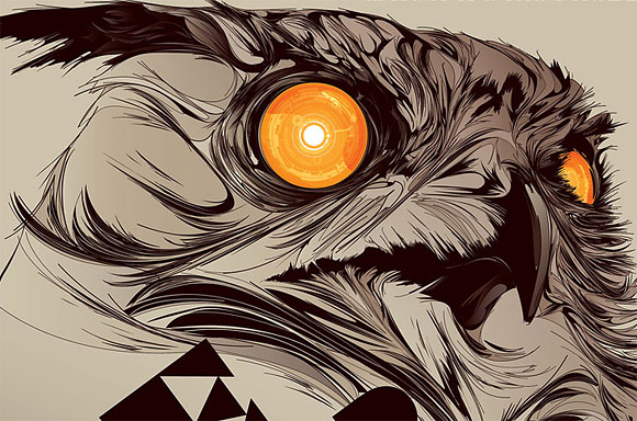
I started by looking around for some inspiration as to how I wanted to work. Primarily working in linocut I liked the idea of using patterns because I think that it shows up well in the print media but also has the ability to work in pen and ink for finer detail or shorter deadlines.
I drew inspiration from the likes of Swoon and Lynd Ward (who I've blogged about previously) as they work in the same media, but here are some other artists whose style I particularly like and want to try to draw from:
Kakofonia
Andreas Preis
Si Scott
Luke Dixon
So with these artists and styles in mind I began to sketch a few things like birds, other animals and tried some portraits to improve in that area too:
Crow study style test
James Dean Style test
Tiger style test
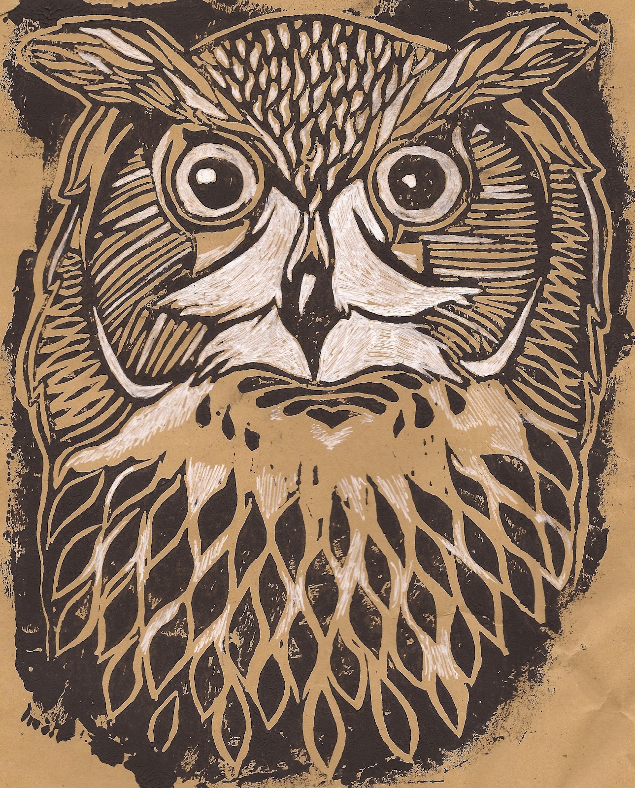
I liked the way that these initial sketches had turned out and couldn't wait to try print in this way as I haven't really done anything particularly detailed with linocut. So with this in mind I began to do some more sketches and doodles with the possibility of taking it into print in mind whilst drawing it. This meant working at a slightly bigger scale, considering where bold black areas are and the contrast of the image, something I need to get into the habit of when working in linocut!
Skull style test
Owl style test in linocut
I finally took one into lino, experimenting with different papers and colours and combining the dark lines of lino with adding white in certain areas. I'm quite pleased with how it came out and can't wait to continue to experiment with other images.
Magpie Colour style test
Red Panda Colour style test
So I've moved onto looking at how to use the patterns and bold blocks of dark lines that you get in print with a watercolour finish. Like I said I'm pleased with where my style is going and look forward to pushing it further throughout summer.
I'm currently turning my focus away from an animal subject to figurative and portraits in this style to see how it works and will post my results at some point! (Really this is just a procrastination exercise away from the dreaded dissertation but shhhh it's still productive!!) Hope everyone's having a lovely summer! and any feedback etc. is always appreciated . .
Before I came to university, I never really considered any legal or ethical implications of a career in illustration. Last year, we had two lectures that were about design ethics, and for me, it was a bit of a wake up call. Although I did at the time believe that it didn't necessarily have much to do with myself as an illustrator, in hindsight, I realise that post-university, I may be challenged with a brief that infringes on my morals. We all have things that we feel passionately about, whether it's something we think should be stopped or something we think should be accepted. It's important that we don't back down from those morals when faced with the challenge of money or morals. Obviously it's easy for me to say this, but I'd like to think I'd stick to my guns.
During creative futures, I went to a talk by a childrens illustrator who, although her style of work wasn't the way I work, and her work ethic wasn't necessarily similar to mine, I respected to work that she creates. She worked abroad by creating reading books for children in Africa, something that is making a difference.
For me, the best thing about my an artist is that we have the ability to communicate a message without barriers. Visual communication can break the language barriers that can hold back important messages, and so as well as thinking about facing moral dilemmas when accepting jobs, I'd also like to actively seek out jobs for this reason too. I have certain things that I feel strongly about, and have ideas as to how I can channel those feelings through my artwork, and so in the future, I hope to be able to create work that has a meaning to it. If there's one thing I could do by the end of my illustration career, it would be to create work that resonates with someone, makes someone think twice or even inspires someone. I realise that to some degree that's all that most people want to be able to do, but I definitely want to be able to say that I put my skill to good use over purely aesthetic reasons.
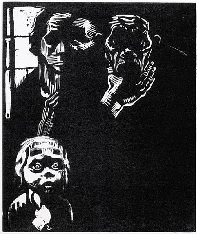
Branching from this, one of my favourite printmakers, Kathe Kollwitz, defintely inspired my want to be able to evoke something within an audience. As soon as I saw her work a few years ago, I immediately saw the emotion that she put into it. It wasn't until I began to seriously consider print and researched it that I linked her to it, but the way she uses the medium to convey the message and emotion that she wanted to, specifically her feelings towards the war that dramatically effected her life. She created a response to the First World War, in which she lost her son, to depict the grief that loved ones were left with post war. For me, this is what having an artistic ability is all about, being able to effect others with your work, although it would obviously be ideal to be able to make a living off of it too.
Kathe Kollwitz, Hunger.
Kathe Kollowitz, above and below two woodcuts from her series Krieg (War).
As a follow up to my dissertation post, I wanted to do a post that briefly summarised my reasoning of picking my chosen subject, as well as some influences I had in getting there.
Since I started experimenting in the Print medium, I've discovered that it is predominantly linked to fine art, whereas I approach the medium from an illustration perspective. I'm not saying that there aren't successful illustrators who practise printmaking, but they tend to be outnumbered by fine artists. It also seems to be a medium that can often be overlooked, something I'm guilty of until I realised the error of my ways!
I've mentioned numerous times before in my blog that for me, print just seems to fit; something I find difficult to expand upon but i'll try. I started with print after being advised by my lecturer that she felt it was a media that would suit me and I should try it; so I did, and fell in love with it! For me, the fact that printmaking has so many options definitely appeals to me, that you don't necessarily have to be limited to one technique. I also like that print can be experimental, that you can stumble across an effect accidently but it works for the best. With print, I find myself wanting to try every technique, experiment, combine them and see what they can be used for and what they can't. It's a medium that i'm still learning but from what i've got at the moment, I think it's one i'm going to persue.
So hopefully my dissertation will help push this interest further and maybe even reflect into my work.
Here's some of the work I've found whilst conducting the initial research for my proposal:
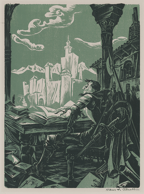
Hans Alexander Mueller:
Although there are many exceptions (above and below being two!) I tend to think that many woodcuts/Lino can look dated when looked at in a modern sense. I love it when I find one that is timeless, a true sign of a master printmaker.
Lynd Ward:
AJ Masthay:
Although I haven't really ventured into colour yet with print, I think the above example is incredible, to the point where it is almost unrecogniseable as a linocut. I like how Masthay creates such powerful images in all his work, something I aspire to do in the future.
Nick Morley:
Nick Morley may be better known as LinocutBoy, all his work is lovely and changes the way that print is often used. In the above example I particularly like how all the lines have a purpose, they're not just pieces that were left behind by the cutter but add to the detail of the face. I'm interested in using patterns with linocut, something that stemmed from seeing this image.
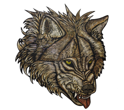
Wolfbat Studio:
Dennis McNett and wolfbat studios create very powerful images, obviously alot of wolves are featured, and like Masthays work, they can go to the point where it can be overlooked as a print. I think that just goes to show the skill in which these printmakers have, to be able to work the notoriously difficult medium in a way that makes it look flawless.
I think this goes to show that although I may not have discovered the style in which I want to work in print yet, I'm gradually taking bits from prints that I see and trying to apply them to my work.
"5000 word essay" is perhaps the most awful words that can be said in art school, although with that being said, I don't mind an essay or two, given that the subject is right. And considering we get to pick a subject we are interested in, research into it and write about it, I'd say we've got it pretty good!
So I instantly knew my subject that I'd write about: Printmaking, I just had to narrow it down to a question that I wanted to write about. Now I chose print because I want to further my knowledge of it, but because of this, I'm finding so many things that I want to talk about and having a hard time to condense it down to a single thing. I wanted to avoid the typical "Digital Vs Traditional" debate or the question of whether Print is dead, simply because It's not and I'd be done in a few words.
So bypassing these subjects, I needed to find a topic that was about printmaking in Illustration as opposed to fine art, was interesting and taught me things I didn't know about print before. I mind mapped continuously, as well as constantly changing my question before I went down to speak to John the in house printmaker. He gave me some answers to the questions I would ask in my dissertation, and from our talk I left with a possible topic I could write about. The next generation of Printmakers - Will print die out with this generation? It sounds interesting already! I emailed my lecturer who knows print quite well, and asked for her opinion. Although she liked the idea she felt that I still had too many questions that made up the "bigger question", I already had a feeling that this was the case.
So at this point I'm trying to condense it down, narrow it into questions that are directly relevant and will discuss them with her later in the week.
At first when I started researching what it was I wanted to write about, I was quite determined to find a topic that wouldn't get bogged down with anything historical, something that I now realise was completely ridiculous! I panicked a bit when the tutor in charge of the dissertation mentioned Key theorists, to which I had none! This made me realise that in order to write a decent essay, with a good debate and critical analysis i'd need to put in some history. To my surprise it was there in front of me all along, there's a key text that my tutor advised me to read: Walter Benjamin's Art in the Age of Mechanical Reproduction, but I also realised that Bauhaus will play a massive part in my writing - I'm trying to prove that print can have a future in modern art, something that Bauhaus did when they took traditional methods and used them in modern ways. I need to research more into that over the summer but I believe it will work. I also want to go back onto the lectures we received earlier in the year about movements like the constructivists because they could also play a part in showing how print can be revived when put with a purpose.
On the whole I'd say that I have a good idea of what it is that I'm going to write about, I just have to make it more specific in order to fit into a 5000 word essay.
Researching this proposal has made me realise how difficult it can be to find things related to printmaking in Illustration - a point that helped me decide that my topic was the right one and had potential!
I'm looking forward to being able to link what I find out through my written research and putting into practise in my studio/professional work.
After speaking to the printmaker at uni, and some of the speakers at creative futures, you need to always be drawing and improve your skills. Especially when i'm trying out a new (craft-based) media, keeping and building on my drawing skills is important. My goddaughter is getting christened next week and so I thought i'd take on a personal project to do a portrait of her and her siblings as a gift. Pressure!
Now I wouldn't say that I'm particularly good at drawing people, although I do have my moments and always willing to challenge myself to improve.
I obviously had to gather quite alot of reference, and had to collect pictures separately so that it looked the best way. I actually enjoyed doing this project alot, even though I sometimes got frustrated because I was trying to get a similarity in looks, I learnt alot doing it. I learnt to step away from it after a certain amount of time spent on it and then go back to it instead of rushing it and to look at it in a different way. Something I should apply to my university work in order to get the best results.
I started out with drawing out the separate portraits before pulling them together over the light box, something that shows how university has made me approach things more professionally. I then coloured it using prismacolour pencils, something that I don't usually work with but worked best for the purpose of the project. This media let me experiment with colours, blending, tones and shades, something that I don't often think about when in print. I'm learning that just because you specialise in a particular area (print) it's useful to also be capable of working in others too for different jobs. Although I do like finding ways to integrate printmaking into my work in a way when it's suitable.
I then also reverted back into my comfort zone by using graphite and charcoal to produce a tonal portrait, just to see which worked better (I like to have options).
So, after many hours of debating whether it looks like them, alot of frustration and numerous changes, I finally reached a point where I felt enough was enough and that if I went further then it could turn out over worked (another thing i'm slowly learning through uni). Obviously it has its flaws, looking at it I sometimes prefer the line work as opposed to full colour, and it was never going to be super realistic due to the nature of my style but I am happy with how it turned out and the things i've learnt whilst doing it. Not sure as to which i'll decide to give as a gift but glad that it's finally done!
. . personal work with professional (kind of) work. .
So this easter break I had quite a bit of work to get through. I had taken on two personal projects; one being a present (which i'll post at a later date) and the second being an antry for a local exhibition/sale. The exhibition is put on in my local town by the church every year, where the local press and general public are invited to see artwork that's been submitted (in any media, of any subject) and even have the option to buy. In past years I've either lacked confidence to put something in or missed the deadline so this year I was determined, and with settling into printmaking, I wanted to be able to go against the usual traditional stuff that gets entered. So I started off the two weeks that I had off by trying to get these finished (although maybe I should have done it the other way with uni work first) I also recognised that I couldn't do anything too daring considering the audience that were probably going to see it but I still wanted it to represent how I work. Like I said I wanted to take a spin on the usual entries of flowers, still life, landscapes etc and so I settled on an animal picture with a twist.
Watercolour brick wall
Linocut cat image printed on top.
Coloured using watercolour.
Window frame detail added.
Paper doily added for window detail (net curtain)
Finally I window mounted and framed it.
Named: The Inquisitive Visitor (mixed media - watercolour, linocut and collage)
The exhibition isn't until the beginning of May but i'm glad I finished it in plenty of time instead of leaving it until last minute (as per usual). The exhibition starts on May 7th until May 12th, if anybody is out there and wants to check it out it's in Mold St Marys church!
(I'll post how it's recieved when the event has been!)
After blogging about the creative futures week we had, I realised just how much I had learnt; both good points and bad points. Although the majority of talks I went to were very informative and inspiring, some of the talks that we went to I didn't blog about, partly because I didn't want to be too negative when I didn't get much out of the talk. However I have been able to draw a few things from those talks that made me realise what I don't want to do and what I'd do differently (should avoid) in my career.
Along the way I have posted the advice that i've taken away from each talk but there was some general bits of advice that came up in more than one lecture.
The Importance of social media - This was stressed in several lectures! We should be using social networking to get a foot in to the industry, it's that much easier (So to speak) to get yourself noticed today and we should be aware of that. That being said some also said that we should be careful what it is that we're putting out there and how. It can also be dangerous with it being so easy, only put work out there that you're happy with, that represents what you do. Be aware of your Internet presence.
Don't be deterred - a career in the creative industries is going to be tough at times, especially getting started but don't back down, if it's what you want then push for it. Nothing worth having comes easy!
Be sure of what it is that you want to do - I was never a fan of doing this, I saw it as limiting myself and so I didn't want to settle into a style or a single media. But after going to some of the talks, I realised that the reason the speakers never achieved what they wanted was because they didn't really know what that was. Some didn't work in a distinctive style and therefore tended to blend in instead of stand out, something I don't want to do! So whilst I don't necessarily know what exactly I want to do, I know how I want to work and in what media. It's a start!
So that's the pieces of advice that were reiterated throughout creative futures week, although it's not all that i've taken from the week. This year I took creative futures a lot more serious than I did last year; this year I went to ones that may not be directly related but have relevance and therefore broadened my outlook to my work. I can honestly say that I can't wait for next year!
On the last day of creative futures, Andy Cheetham of CheethamBell JWT, but his talk was about his time before his successful career and how he got his foot into the industry.
He started by drawing comparisons between the time where he was trying to get into the industry and to the current time, where we too are trying our hand. The 80's was in a similar climate as to what we are in now, redundancy was rife and it seemed like the odds were against you. Andy was a 24 year old, recently made redundant with no job to go in to and was made worse with things such as his car being stolen. He applied for a local newspaper job but was told that he was over qualified, that he should aim higher and go into advertising, and so he broadened his horizons and applied to ad agencies in Manchester. Although he got the job and stayed for a few years, he decided he wanted to move on and realised he needed a reputation if he was ever going to become part of the industry.
He realised that to build up a reputation he needed to get noticed and did this through the awards system. He explained that he collaborated with a friend and started their own agency, and planned on winning awards for advertising. He chose to advertise Barnacles, a North Wales fish and chip shop, which unbeknownst to the judges, was owned by his mother. They created press ads that were simple but effective, ads that ran in newspapers only and in mainly local press too before expanding after a few wins. He explained that they played on the fact that people love concept and that if you have a good concept then it will carry itself. At the time they were changing the way that things were advertised, taking it past long copy and making advertising more creative and effective.
Although he faced criticism and uproar by fellow agencies, due to the size of his agency, he went on to win numerous awards (D&AD, Roses etc) and top creatives loved it! The loophole that allowed smaller agencies with smaller press runs eventually closed, which put an end to Andy's winning streak but by this time he'd managed to achieve what he'd set out to. He'd created a buzz around him, showed his potential and became one of the biggest agencies operating outside of London. His story was also the inspiration behind the chip shop awards, an award set up for those that didn't fit into the mainstream categories, and shows that creativity has no limits.
CheethamBell JWT latest campaign for John West "Discover the story behind every can".
Tips that Andy left us with:
People stilllove a good concept!
You can't hide behind the economy - push through the bad times in order to reach success!
Put the effort in.
People who make things happen, don't know the word can't.
spend time getting things right.
Know what's good out there.
Edit, edit, edit - always evaluate yourself - be critical.
Andy's talk was very influential, and although it's in an area that doesn't particularly interest me as an illustrator, his story can be applied to all creatives and further afield! It shows that determination pays off and that even when it seems that everything is going wrong, you have to pursue in order to reach success. Triumph over adversity. Although it is not the type of work that I would want to do, however it is something that can be applied to everyone; don't wait for things to come to you. If you want something then go after it, no matter what is put against you (rules of the competitions in Andys case) and that you should never give up.
. . Ernest Hemingway once wrote a 6 word story. If you think that it's sad, then you made it sad. It's left open to the interpretation of the reader, is it a tragic ending or just a baby that's particularly picky when it comes to shoes?
Stories are so powerful that we lie, exaggerate and omit the truth in favour of telling a good story - Errol Morris.
Everyone's a storyteller, whether it's the latest gossip, what you got up to at the weekend or the next bestseller, we all have stories to tell. For a long time I didn't see myself as a storyteller, as someone who loves reading and has an absolute ton of ideas that could be made into stories, it's the putting pen to paper and running from beginning to end that I struggle. This being said, we were presented with two new briefs in studio this week, one for the general illustrators (me) that was a competition brief under "Secret London" whilst the other was the MacMillan Children's book competition. I like a challenge so I've decided to go for the book option, but to do the London piece as a portfolio piece when I have time.
With an emphasis on storytelling in the briefs, we were given a little lecture on the fundamentals. In the lecture we were shown a TED talk of Andrew Stanton from earlier in the month, it was extremely useful.
Andrew makes the point that we as storytellers have an aim to make the audience care, we need to carefully consider characters, the plot, the messages that we send out through the story. He also highlighted the importance of the beginning of the story, where we make a promise to the audience that the story is worth their time. I particularly liked that he said storytelling has guidelines, not hard set rules*. Something that can be applied to most things, rules can be broken, as long as it's done in an appropriate way and purposefully. *See Hemingway quote at top of page!
Before I saw this talk, I was debating on which brief to take, the one set for me (the safe option) or the challenging children's book. After this talk I whole heartedly went for the MacMillan brief, I want to challenge myself, I want to be able to tell a story, I want to evoke wonder! Who doesn't?!
Kurt Vonnegut on the shape of stories.
Dan Harmon's Story Circles.
Here's some of the tips I picked up today:
There needs to be fluctuation in a story to make it interesting.
You have to be aware of the problems you introduce in your story; every problems needs to be solved.
You have to mindmap all the possible ways your story can go in order to get the best possible plot; explore every possibility.
Write what you know! Draw from experiences.
Don't be afraid to tackle sensitive topics, it can be done!
Exercise your imagination!!
I want to tell story that inspire, are imaginative and carry a message. Although I do struggle to write a complete story, I feel that if I stick to these reasons for writing and I'm passionate about the subject then I'll be able to.
Like I said, everyone is capable of telling a story, you just have to find the story that you want to tell!
Here's some of the research that I've come across when researching artists that use words in their artwork and use typography as imagery, with a bit of what I've learnt about type thrown in too!
Tony Ariawan:
Greg Lamarche:
In this example, Greg combines a collage of decorative type that influences your view of the image. If the image was a stand aloe one then there would be a range of possibilities of what could be happening with them, what they meant. But with the type present, you automatically see the purpose. This shows how type can influence how you view things when partnered with things like an image.
Si Scott:
The thing I like about Si Scott's work is that the typography is often done in the same style that the imagery is, which means that they fit perfectly together. You can instantly identify someone to their style, and already having a type that fits your style saves time when you get a brief that requires it.
Craig Ward:
Alex Beltechi:
Alex creates incredible visual typography, this is simply an example of one.The text he creates usually reflects or at least compliments the imagery or theme that he has chosen. An example how text and image can compliment each other and convey a theme or message.
Yulia Brodskaya:
Yulia Brodskaya is an absolute genius, she creates typography that can be dull statements and brings them to life through patterns, colour and swirls! It's a way of visually communicating a message by combining imagery and typography.
Maria Boavida:
Maria explores type and image through her Illustration meets typography series. She wants the audience to take a journey of discovery, whether the letters lead you to see the image or if the image reveals the letters. This can show how typography influences how images and there messages are seen, or how images can reinforce the typography.
I'm constantly learning about type, and feel like i'm slowly getting a better understanding of how it can be used. I do tend to lean towards decorative/ hand drawn type, mainly due to my style of work and the fact I prefer to work by hand over the computer. To me, type is type, but like I said, I am beginning to see that there are different ways that you can use it, in different forms and for different things. I'll get there eventually!


.jpg)